
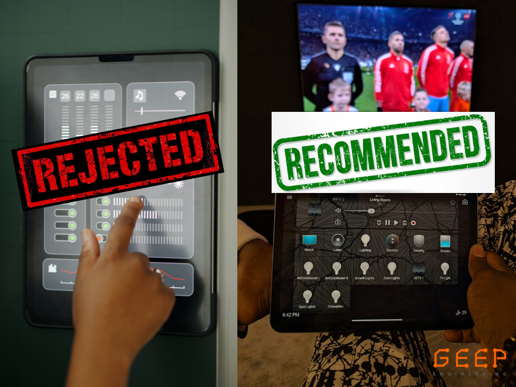
On the left, you see what we frequently
REJECT: Overly complex, data-heavy interfaces that prioritise “cool” graphics over actual usability.
On the right is what we RECOMMEND: A clean, centralised dashboard that puts total control of your environment; lighting, climate, security, and entertainment — right at your fingertips.
Why the “Rejected” Side Fails:
- Cognitive Overload: Too many sliders and bars make simple tasks frustrating.
- Static Placement: Fixed wall mounts are great, but they shouldn’t be your only point of control.
- Lack of Context: If you can’t tell what a button does at a glance, the design has failed.
Why the “Recommended” Side Wins
- Intuitive Iconography: “Watch,” “Listen,” and “Lighting” are clear, actionable icons.
- Mobility: High-performance control should follow you from the boardroom to the lounge.
- Unified Ecosystem: Notice how AC, lighting, and DSTV are all in one place? That’s true integration.
Stop Settling for “Complex.” Choose “Seamless.”
At GEEP Engineering, we don’t just install hardware; we design experiences. If your current interface looks like the “Rejected” side, it’s time for an upgrade.
Ready to simplify your space? Let’s talk.
📧 Email: hello@geepengineering.com
🌐 Explore our work: www.geepengineering.com
#GEEPEngineering #UserExperience #SmartOffice #AVDesign #HomeAutomation #TechIntegration #KeepItSimple #Control4 #Lutron